The misty history of the stars, waves and shield.
In the beginning.
The exact form of Philips' shield emblem and the Philips wordmark as we know them today was defined in 1968. Before this date there were many variations of both - so many, in fact, that it is now difficult to trace their exact evolution. The main lines, however, are clear enough. The history of the shield emblem, with its stars and waves contained in a circle, stretches back more than seventy years.
![Philips logo emblem]()
There are conflicting claims about how the Philips logo came into being. Kalff stated that he originally conceived the idea of the three wavy lines after learning that sound consists of waves travelling through the ether. However, Johan van der Ley, who joined the company in 1929, asserted that he was the true begetter of the emblem: he said that the star spangles stood for electric lighting and were only gradually integrated with the wavy lines. In due course, these two elements were placed in a circle, presumably symbolizing the globe.
Today, almost three-quarters of a century later, we shall probably never know which is the true version of events (and, of course, maybe both are correct), but the bare facts alone make interesting reading...
A star is born
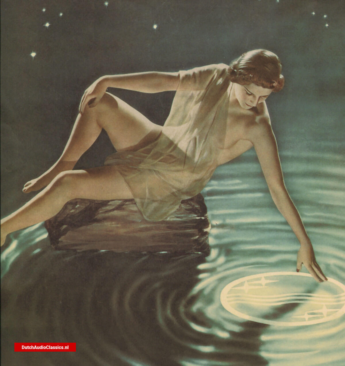
Around 1925, the wavy lines and star spangles, representing radio waves travelling through the air, were first used on stationery and in advertising and other promotional materials. They also appeared on packaging for the 'Miniwatt' radio valve and on the Philigraph, an early sound recording device. The number of star spangles used in this early period varied widely. Examples exist of a single spangle, a combination of two and a blanket of up to twelve! It was not until 1930 that the four stars flanking three waves first came together within a circle, to decorate the circular opening of a loudspeaker. Over the next few years, the circle emblem was extended to advertising material and other products. This consistent and widespread use led to it being registered as a trademark in the Netherlands in 1934.
![Philips logo emblem]() An early add showing the Philips logo.
An early add showing the Philips logo.
A motto and a coat of arms
However, when Philips applied for trademark registration of the circle emblem in other commercially important countries, it turned out that ICI, the multinational chemical company, had a similar circular trademark for the same or similar goods. This made it impossible for Philips to use their circle emblem unrestrictedly.
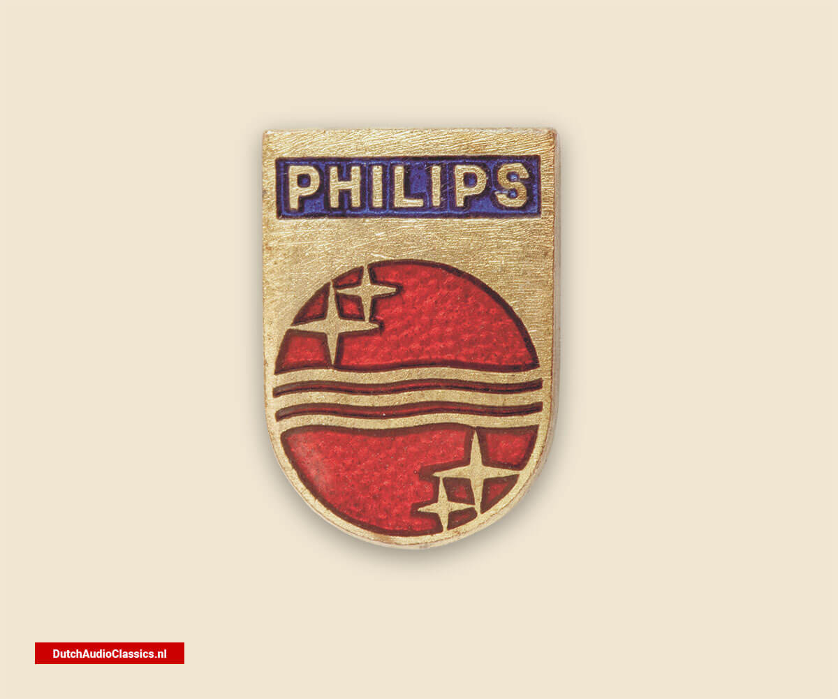
As a result, it was then decided to combine the circle emblem and the company's name within a shield. The resulting and now world-famous shield emblem first appeared ij 1938 and was registered in 1948. Since then, this trademark has been used across the world and has become one of the Philips house marks identifying the Philips Company as the single source of Philips-branded products. Rumor even has it that the shield emblem served as a virtual coat of arms for the noble aspirations of the Philips family, with the mere family name their motto...
![Philips logo emblem]() These examples show how many waves, stars and shield forms were combined in various ways during the company's early information.
These examples show how many waves, stars and shield forms were combined in various ways during the company's early information.
The might of the shield
There are also early examples of shield-emlbem elements used independently rather than in combination. For instance, in 1935 we find the wavy lines inside a shield but without either circle or star spangles. This version decorated a radio valve known as Miniwatt AK 2 Octode. And as early as the 1920s, we saw the appearance of a circular microphone suspended by four springs inside a metal frame shaped like a shield.
The name Philips was added to the inside of the shield frame, not at the top (as it is today) but instead at the bottom. Through the years, as well, the shield emblem has been combined ingeniously with many other design elements, in a variety of different colors.
The wordmark
And what of the wordmark? Today, we are all used to seeing the name 'Philips' in uniform capital letters and in a sans-serif font. It may appear in different sizes and colors, but the basic shape of the seven capitalized letters is instantly recognizable wherever in the world we encounter it. However, it wasn't always like this. In the early years of the company, the representation of the name took many forms. One was the letterhead, in fine copperplate script, another was an emblem formed by the initial letters of Philips & Co, while a third was the single word 'Philips', printed on the glass of metal filament lamps. In 1898, Anton Philips used a range of postcards showing Dutch national costumes as marketing tools. Each letter of thw word 'Philips' was printed in a row of light bulbs at the top of every card. In the later 1920s, the name began to take on form we recognize today. The name was registered in the Netherlands as a trademark in 1930.
![Philips logo emblem]() Construction specifications of an early wordmark and circle emblem.
Construction specifications of an early wordmark and circle emblem.
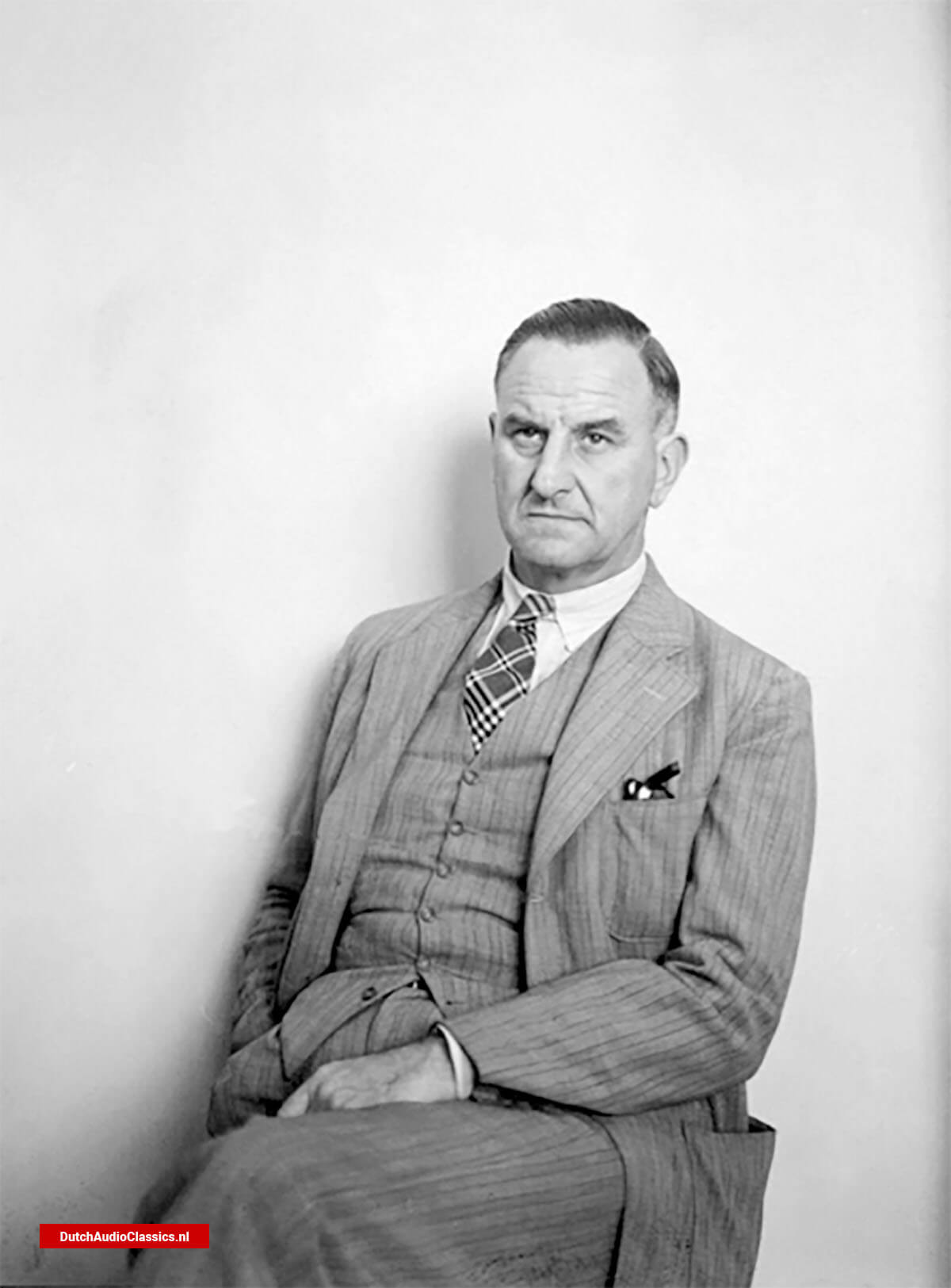
Mr Kalff about the history of the Philips emblem.
"The famous Philips emblem, the stars and the waves, came about by coincidence. As an architect I had no idea how a radio worked. So I asked "What is a radio, actually? And how do you transmit sound?" Somebody told me that waves were sent out into the air, the air that surrounds us al, and that these radio waves could transmit sound. When I first had to make the packaging for radio lamps, I used the colors yellow, red and purple. A purple background with yellow square stars - they became a sort of Philips stamp too - and under that a yellow strip with red waves, six angles, three below each other, that crossed the purple sky with the yellow stars. And the word Philips was printed below it all.
![Louis Christiaan Kalff - Philips logo emblem]() Louis Christiaan Kalff
Louis Christiaan Kalff
The first appliances we made, radios and gramophones, were wooden boxes made by the NSF in Hilversum. At the same time, we were looking around for another company that could make the boxes. We went into business with a piano manufacturer, Phillips (with a double 'l') from Frankfurt. In that piano factory, alongside the fine furniture they were making for grand pianos, we made our first radio gramophones. Inside the opening of the loudspeaker, we put three waves and four stars. They were first made of wood, and later of bakelite. They were the decorative opening that hid the loudspeaker behind. Having got that far, the Patents Departement asked if we could combine the waves and the stars, which had pretty much become trademarks, with the word Philips, as they thought that the trademark could be protected that way.
That's when I made the Philips emblem with the word Philips at the top and underneath a circle with the waves and the stars. It was so popular that Mr Philips thought it necessary to make little enamel pins with the emblem on them for Security to wear on their hats and for traders to hand them out at conferences. Then the Lighting Departement asked if they could have a similar sort of emblem.
I designed an emblem for them with the word Philips at the top and a bulb with a sort of hao around it. For years, it was used on all their headed paper and on the railway trucks at the request of Mr v.d. Bos in Dispatch so that everyone could see that there were so many trucks carrying Philips' bulbs. In time, the difference between radio and lighting diminished and we focused on just the one emblem - the one emblem that become so famous. The emblem that I always see, wherever I may be.
The emblem has, however, been cause for occasional critism and we've sometimes been teased about it. The wry English have a story about it. They say, 'Do you know what it means? This is a vicious circle and in the vicious circle you see three crooked lines and two double crosses.'
Just how much other producers envy this emblem is clearly shown by the huge number of legal actions taken each year to protect it. On average, there are 50 to 60 infringements per year, and they always have to be fought. Whether it's Sout America, England or somewhere else, it keeps happening, again and again."
L.C. Kalff

 An early add showing the Philips logo.
 These examples show how many waves, stars and shield forms were combined in various ways during the company's early information.
 Construction specifications of an early wordmark and circle emblem.
 Louis Christiaan Kalff